Simple changes for a mobile friendly online store
Sat on a train heading through the Welsh countryside, I've been doing some browsing and shopping on my mobile phone (yes, there is mobile signal in strange parts of the Welsh landscape), and have been reliving usability issues in a number of vendors which would make my shopping experience much more enjoyable, and would benefit everyone. They are mistakes I've seen loads of times over the years, and have fixed for various clients over the years.
With Google focusing heavily on mobile usability, and with e-commerce being as popular with mobile users as desktop ones, why out unnecessary friction in the way of conversions, web you can make the following simple changes for common issues? They really are as simple as changing the input type for text fields.
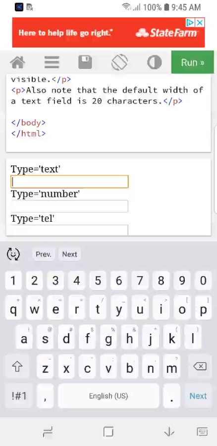
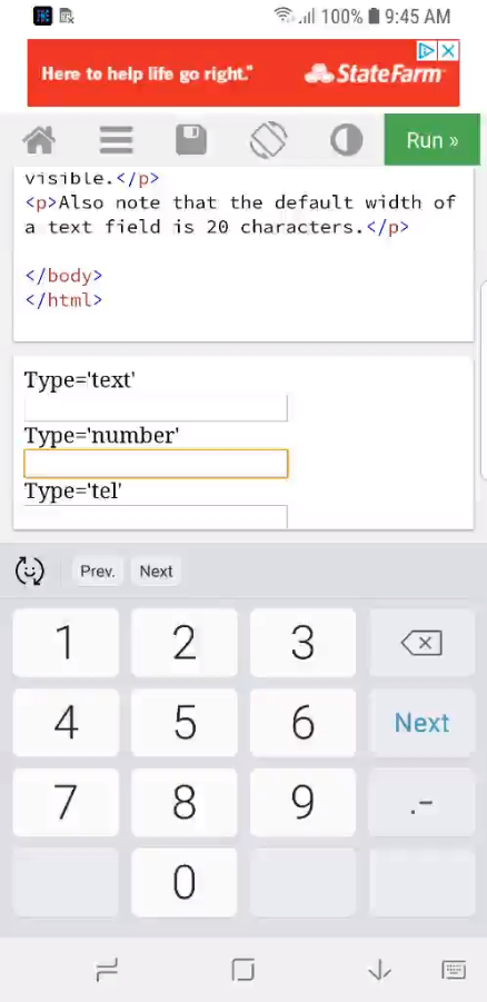
Number fields
I've seen a lot of fields which require numbers only (quantity, credit card number, expiry date, CV2 - though that should likely be a password field) which will bring up the full QWERTY keyboard and make me force my fat fingers into impossibly small boxes for critical information. Honestly, I wanted 2 of those items, not 2wq of them, or 23 of them, and my credit card doesn't actually start 5r6yt. Use the input type number for these fields and you get some free validation checks with the user being presented with the number pad instead of a full keyboard.
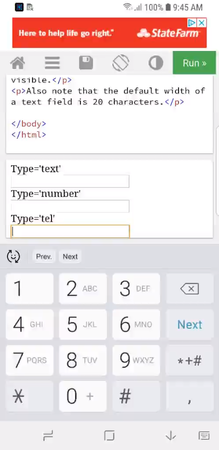
Telephone fields
I deliberately left telephone number out of the above section as HTML5 HAS a telephone input type `type='tel'` which will give a user on mobile the telephone keypad to use. This is similar to the number pad, but doesn't have have the decimal point. This can also be used for credit card numbers to help reduce the number of available options a user can press, and lower their chances of mistakes.
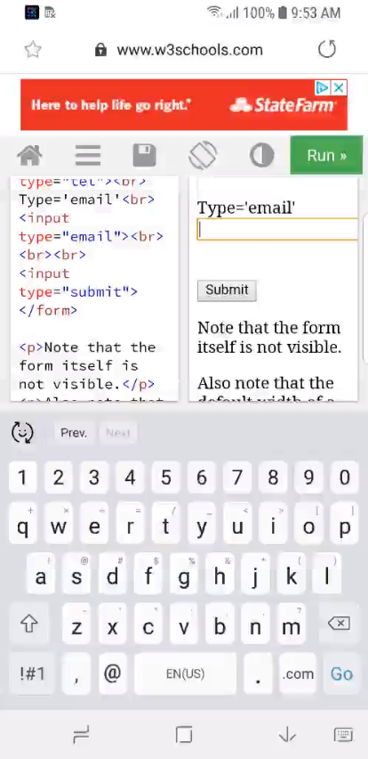
Email addresses
This is fairly trivial, but I hate looking for the @ symbol on my keyhoard when filling out my e-mail address on my mobile, expecting it to be on one of the numbers, and realising I have to go into the symbols to find it. Changing the input type on a form from text to e-mail gives mobile visitors the @ symbol in a sensible place, and also adds a button for .com to speed up the input process.
These are but a few simple changes which should only take a couple of minutes to implement, but will reduce friction in your checkout, and lower visitor frustration when filling out forms during the checkout process. That in turn will, likely, lead to increased conversion on mobile, and higher sales. It's probably taken you longer to read this article than it would take to make these changes, so add them to the list for your developer to make, if they aren't already there.