User Experience? Consider your users

User Experience (UX) is something which has been around for a while. It is becoming more and more prevalent and "buzzwordy" as more people get more technology. Unfortunately, there's still instances where the experience of the user isn't fully considered, and the annoyance it might bring.
I've recently changed broadband providers. I have a totally unnecessary gigabit connection now (pointless information, but I wanted to drop it in all the same), which meant connecting some devices to a new wireless router. Easy enough, until I got to the Sky Q box...
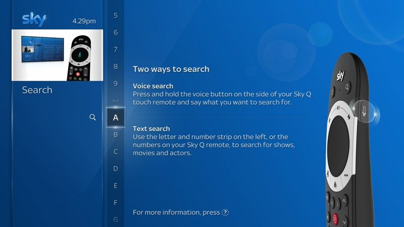
Sky, in their infinite wisdom, have configured the Sky Q box interface to not have a traditional, easy to navigate QWERTY style keyboard on screen. Instead they have a horrible character scrolling bar at the side. You need to scroll through the characters one at a time to find the right one. That's A-Z, a-z, 0-9, and a whole host of symbols. That's 70+ characters to scroll through with a remote, and the scrolling doesn't speed up with a press and hold. You need to repeatedly click the up/down arrows to scroll faster.

This may seem fairly trivial, but if there's a 10 character password for wifi access, and the characters are at opposite ends of the character "wheel", that's 35+ button presses to go from one side to the other, so 350+ button presses to enter a 10 character password. That's a bad user experience.
Compare that to Disney+ (because we signed up for that ahead of launch), where the keyboard is displayed on the form. Going from 'q' to 'M' can be done in around a dozen characters, including pressing shift. Considering 'm' is the 13th letter of the English alphabet, that's the same it would take to go from 'a' to 'm' on the Sky Q interface.
Yes the Sky Q interface works, but it's not at all nice. Sure there's likely the ability to use the WPS button on the router, but the positioning of my router makes this a difficult task (it's on top of a cabinet out of the way of kids). Even with that ability, one easy way of doing something doesn't mean a highly common way of performing the same task (the task being connecting to wifi) should be difficult.
When building a user interface, actually try it out. And not with simple tasks/data entry. If it's a painful experience for you, it's going to be painful for others. A painful experience is a bad user experience, and should be avoided at all costs.